Thursday, January 15, 2009

Make Your Own Color Chart for Watercolor Paints


The illustration above shows a basic color chart for my core palette colors or what I call the Essential 7. This is a great way to find out what combinations you can mix from these seven paint colors.

To create your own color mixing chart:
  • Use a pencil to draw eight rows and columns as shown above.
  • To show how transparent or opaque each pigment is, make a black line using a permanent marker before you apply the colors. When you paint over the black line if the color disappears it is transparent, if you can see the pigment sitting on top of the black line then it has opaque qualities.
  • Each ROW is about the color/hue in that row and what the other colors in the palette do when mixed with the dominant row color.
  • Each COLUMN contains the same colors placed in the same order as in the rows.
  • Mix less of the column color and more of the row color for the best results.
  • Leave a little white space on either side of the pencil lines (between the color squares) to visually separate the colors.
  • NOTE: Each color will be mixed with itself during this process.
  • This chart shows the secondary and tertiary color combinations that are possible by mixing only two tube colors.
  • It's possible to create many more neutral hues by combining three or more tube colors in the basic split primary palette.
  • When the chart was totally dry I erased the pencil lines.

Of course you can make as many rows and columns as you want but I've found that when I want to add new colors to my core palette all I really need to do is add a new row and show how they interact with my 7 core palette colors. If they work with these 7 then I have a color that I can use successfully. If the color isn't compatible with my core palette then I need to be more careful and selective as to how I choose to use that particular paint.

Split Primary Palette

QUESTION: Susie, I was looking for watercolor palette suggestions and found your website. You mention a split primary palette. Would you please explain what a split primary palette is, what colors I need and how to use it? Much thanks for all your help! Judy S. Texas

SUSIE'S REPLY: Hi Judy! Here's what I refer to as a Split Primary Palette

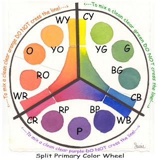
Use a warm and a cool of each primary hue (a warm red and a cool red; a warm yellow and a cool yellow; a warm blue and a cool blue) to mix bright, high-intensity primary called a Mixed Primary Hue. The secret is in using the right split primary colors and not crossing over the lines into another section!


Here's how the Split Primary Palette works:

Let's start with a color wheel arranged like a clock (illustration above) and divided into three equal sections. At the top of the wheel (12 o'clock) a cool yellow, like Hansa Yellow Medium -- a lemony, slight bias to blue-green is on the right of the line; a warm yellow, like New Gamboge -- a golden, slight bias to red-orange is on the left of the line. Going clockwise around the circle (at 4 o'clock) there is a cool blue, like Phthalo Blue (GS) -- an icy, slight bias to blue-green is above the line; a warm blue, like French Ultramarine -- a purplish blue, slight bias to violet is below the line. Continuing clock wise, (at 8 o'clock) a cool red, Quinacridone Rose -- a rosy, slight bias to red-violet is below the line; a warm red, Pyrrol Scarlet -- a tomatoey red, slight bias to red-orange is above the line.

To mix the oranges, mix the red and yellow within the lines to the left of the circle. First mix orange, and then add more yellow for yellow-or ange and more red for red-orange.
To mix the greens, mix the blue and yellow within the lines to the right of the circle. First mix green (2 o'clock), and then add more yellow for yellow-green (1 o'clock) and more blue for blue-green (3 o'clock).
To mix the purples or violets, mix the pink or rose with the blue within the lines at the bottom of the circle. First mix purple (6 o'clock), and then add more blue for blue-violet (5 o'clock) and red for red-violet (7 o'clock).

Now here's the rule that makes this theory work: When mixing two colors on the wheel to achieve high-intensity color, don't cross over the line/stay in each section. Crossing over the lines and mixing the colors on either side of the line causes the mixtures to become less intense and slightly grayer. Cross two lines and even more graying occurs. This graying is called neutralizing. It is the result of a slight touch of that third color being added to the mix.


Hint: To mix earth colors, you simply cross over the lines or add a warm neutral to your mixtures. That's where Quinacridone Burnt Orange -- the seventh color of our essential 7 basics-enters the scene... it's a versatile warm neutral.

You have several good choices for professional artist grade watercolors to choose from.
My palette is currently filled with Daniel Smith Extra Fine Watercolors.

Materials List for Susie's Split Primary Palette
DANIEL SMITH Extra Fine Watercolors

Seven 15ml Tubes - Essential Set offered by Daniel Smith at 40% off regular tube price)
Set contains:
Hansa Yellow Medium
New Gamboge
Phthalo Blue (GS)
French Ultramarine
Quinacridone Rose
Pyrrol Orange
Quinacridone Burnt Orange


Thanks for your questions Judy! Have fun painting and mixing up pretty colors!
SUSIE

For more information about Color check out Nita Leland's book EXPLORING COLOR

and her latest release CONFIDENT COLOR

Color Mixing - Simplified

QUESTION: About color mixing....I'm not looking for the chemical make up of paints but more for the "how to" of mixing paints. Which can be mixed without creating mud. Which colors compliment others visually. How to create a great black or green etc. That type of thing. Thanks.
SUSIE'S REPLY: These are multi-million dollar questions! I'll try to break this down and make it as simple as I can. A quick review of basic color theory reminds us there are three (3) primary colors: RED - YELLOW - BLUE.

We can not make these hues by mixing. We can create variations of each hue by adding one or both of the other colors but we can not mix up a true red, yellow or blue.
Secondary colors or hues (green, orange, and purple) are created by mixing two primaries. Red+yellow=orange; red+blue=purple; blue+yellow=green

Any time the other primary is added chances are the color will be muddy.Example: blue+yellow=green + a tiny bit of red= olive green; not a clean clear true green.
When we use a paint that has the third primary color already premixed into the tube the result is a neutralized or grayed or muddy looking color.

So, in answer to your question about what paint colors can be mixed together without making mud we do need to consider what's already in the tube of paint. Anytime you have a combination of all three primaries you will have a duller more neutralized color. The more equal the amounts of the three colors the muddier or grayer the color will be.

Think about it this way: if a color looks greenish, you know it has blue and yellow in it. If you mix that color with any color that has some red in it the possibility for mixing mud is greater. The more equal the ratio of red + yellow + blue the more neutral the resulting color will be.

Many times we create duller looking colors by over mixing them in our palettes before we apply them to our watercolor paper. If we allow these same colors to "mingle" on our paper and mix together naturally they usually do so in a visually pleasing way.

As for premixed tube color formulas: There are probably as many "formulas" for mixing visually pleasing neutrals as their are watercolorists. For a dark gray or black one very popular combination is Ultramarine Blue and Burnt Sienna. Another formula for black is Alizarin Crimson and Hookers Green.
Here are some tips:
  • Testing the colors on your own palette to see what color combinations you can make will be helpful. Make a color chart. Avoid mixing more than three colors, better yet try not to mix more than two premixed tube colors.
  • Read the labels on your paint tubes. If they contain two or more pigments know that they are good candidates for mud makers when mixed with additional colors using multi-pigments.
  • Another thing to consider is that each brand of paint has different ingredients even though it may have the same color name. So one brand of cobalt blue may mix up differently than another brand of cobalt blue.

My personal recommendation for all new painters ( or anyone who is confused about mixing colors) is to use a limited palette of basic compatible core colors. The brand of paint isn't as important as the choice of your basic colors. Stick to using this limited palette for a period of time to allow you to get acquainted with color mixing and learn all you can about what these core colors will and will not do for you. If you are a prolific painter six months may be enough time for you to work with a limited palette. If you don't have time or don't paint very often you may need as much as a year of working with a limited palette to get the hang of color mixing.

For more information look for my article published by Daniel Smith Some Thoughts on Color and using a Split Primary Palette.


Hang in there! The more you practice the better you will get!

SUSIE


P.S. Be sure to sign up for email updates to this blog to be notified when additional information is shared!

Monday, December 22, 2008

Copyrights and Plagiarism

QUESTION: I am in the process of writing a book illustrated with my own watercolors. However, some of these images were copied from other watercolors, even though the actual painting was ultimately done by me. Is this plagiarism? How different does the final image have to be to be different? These are primarily pictures of tea cups. I don't want to do the wrong thing so would appreciate your opinion. Thanks.

SUSIE'S REPLY: How exciting for you! Writing a book is almost like giving birth and could be considered a labor of love. I wish you every success with your adventure!

Now to get down to the nitty gritty: First and foremost: My opinion is given for guidance only; you're advised to consult a copyright lawyer on copyright issues. My information is based on US copyright law. Remember, although there are international copyright agreements, every country has its own copyright laws.

According to the information found on dictionary.com the term "plagiarism" usually applies to literary theft. Plagiarism occurs when a writer duplicates another writer's language or ideas and then calls the work his or her own. The writers' words are protected by copyright as their legal property. It is permissible to quote another writer as long as you carefully give credit to the writer and the source of your quote.

In regards to visual art there is a myth about how different an image needs to be to not be a considered a copy. Some artists believe (and/or have even been taught) that you can legally use another artist's work if you change or alter a certain percentage of the painting. Some say changing an image 10 percent is enough to make it a new image while others say a change of 20% or 30% is required. This is absolutely not true and is only a myth. A copy is a copy.

A good rule of thumb would be when comparing the two images side by side if the another artist's work is recognizable as what your image is based on then you are risking copyright infringement.

Objects or subjects such as "teacups" or the "sunset" can not be copyrighted so that they can only be painted by a single copyright owner. Another artist's work can inspire you but the concept and composition of your painting should be uniquely your own not a copy of their work.

Since you asked for my opinion, if it were my book, I'd use my own teacups, my own sketches and my own reference photos to paint the illustrations from. Let it be totally and uniquely your own without the shadow lurking over you that you might not be doing the right thing.
Just consider any copied images you've done so far practice for what's yet to come.

My personal policy is "if in doubt, don't!" Let you conscience be your guide.

Again, I wish you success with your new book! Please let me know when it's available... I like teacups!

I look forward to seeing your original watercolor illustrations.

SUSIE

Saturday, December 20, 2008

Stretching Watercolor Papers- Removing Sizing

QUESTION: Hi, I just finished your DVD Painting across America The Oregon Coast. The DVD was fun easy to follow. I do have one question about stretching paper. There are several pros and cons to stretching. One of the pros that I have been taught is that stretching removes the sizing. What do you think? Debbie

SUSIE'S REPLY: Hi Debbie! I'm so pleased you enjoyed the DVD on painting the Oregon Coast. Thanks!
About stretching watercolor paper: If you asked five different instructors about the pros and cons of stretching watercolor paper, you'd probably get five different answers. That's because we all develop our own style and techniques for painting and what works best for us as we learn to paint. None of us are wrong, but my method may not be best for someone else's style. And that's OK!
What do I think?
About sizing: For me personally, I like the sizing on my paper. Sizing enables me to use techniques that require a more durable paper surface. (Like glazing, scrubbing and lifting) I use Arches 140# CP for most of my paintings. I understand (with Arches watercolor paper) the sizing is added to the paper pulp as it is processed (referred to as internally sized) so the sizing is the same on both sides of the paper. Some brands of watercolor papers spray the sizing on the surface after the paper is made. I'm guessing those papers might need to have some of the sizing removed to make the paint flow better for the artist. Which is better? It really depends on the technique and style of the individual artist.
So for me personally for my style of painting removing the sizing isn't a pro, it's a con.
More About stretching: I know some artists who will not paint on unstretched paper...period!
My preference is to paint on high quality unstretched loosely secured watercolor paper. I enjoy the freedom to tilt and bend the flexible paper to create interesting mingling of the paint if my painting session take a turn in that direction. Plus I work on a number of paintings at the same time so if I did stretch my paper I'd need dozens of backer boards to hold my works in progress.
When I've worked on the taunt surface of stretched paper it wasn't that I didn't like it, but I did need to make adjustment to my brushstrokes and work differently.
Call me lazy, but personally, I'd rather be painting than spending the extra time it takes to stretch my watercolor paper. But that's me!

Thanks for your question!
SUSIE

How important is drawing?

QUESTION: Hi Susie! Love your work. My question is this: I want to be an artist, like you. I practise drawing and painting for approximately two hours a day. Is this enough? In Gordon MacKenzie's book he states that to be an artist you have to start building a data base. What does he mean? Any pointers you can give me would be much appreciated. Paul


SUSIE'S REPLY: Hello Paul, thanks for your question. I'm sure many other artists wonder about the importance of drawing and how it applies to painting....especially watercolor painting!

I believe that the more you draw the better you will be in every art medium. Drawing is a great hand and eye coordination exercise. Transferring what you see to the paper can also train your eye to really look at the object/subject. Draw every chance you get whether it for a painting or not.

When I'm teaching I use a simplified line drawing (for my students to see what I'm visualizing in my head) to illustrate placement and/or perspective. To me the lines are meant to be guidelines like a road map and are not intended to be the exact edge of my subject. I like to use my brush to create the shapes of the objects not following pre-made pencil lines exactly. When I try to force the paint to stay inside the lines my painting looks and feels tight and over controlled.

Most of my paintings are painted "free hand" without any pencil lines. It took me several years to get to this place. However I did draw on my paper when I started painting. The reason I can paint without pencil lines is because I do draw a lot and the information I save in my "data base" is accessed when my brush starts to draw on my watercolor paper.

In response to your specific question --- I thumbed through MacKenzie's book The Watercolorist's Essential Notebook to find what you were referring to so I wouldn't take it out of context and I'm sorry to say I didn't find it. (Perhaps you could send me the the page number.)

What he could have meant by "starting to build a data base" may have meant to become familiar with your subject and how it is shaped so that when you start to paint it you have an understanding about how it is put together or how it grows so as you paint the subject it looks natural. If we are painting something from memory or sometimes even from a photo, and we get to a place where we don't know exactly what's next we have to fake it to fill in a gap. It's much better to have a 'data base' from previous drawings to refer to. As I said I'm not sure that's what he meant but its a good guess.

I hope that helps some. Draw Draw Draw! Enjoy drawing and learning all you can about the subjects and objects that interest you. Then when you start to paint those things you will be so familiar with them painting their shapes will be second nature.

Most of all have fun!
SUSIE

ADDITIONAL COMMENT!! I found the MacKenzie reference! It's in his Landscapes book. What he means by "Start building your own data base." is to take notes and write down what it is you like about a specific painting or photo that inspires you. Take photos of your own when you see something you'd like to paint. Keep a sketchbook to remind you of the things you want to paint. He also says, "...there is no better way to improve your ability to see than to draw."
So we were on the same track. :) SS


Monday, November 17, 2008

Easy Watercolor Christmas Cards

Question: Hi Susie, I'm a beginning watercolor student and would like to paint my own Christmas cards this year. What suggestions would you have for a beginner who would like to paint something simple but something that expresses the beauty of Christmas?

SUSIE'S REPLY:
I think that receiving a hand painted greeting card is so special! I have some Holiday card suggestions on my website that should give you some ideas for painting simple cards. For beginners (and kids) I recommend easy shapes such as those you might find for making cookies. Try painting a wreath or a stocking, a gingerbread man, Christmas tree, star etc each can be as simple or ornate as your imagination allows. Add a border. Dare to dream!

Here is a link to my free Christmas Card Ideas
and here's a link to my Winter Landscape Cards with patterns and instructions
and you can find some additional tips on my watercolor tips pages

Have fun painting your cards! Keep them simple and I know you can do it!

Merry Christmas!
SUSIE