HOW CAN I TELL THE BIAS ,OR UNDERTONE, OF DIFFERENT WATERCOLOR PAINTS? --Peter Russell, UK
Susie's Reply: Great question! I will try to answer this one as simply as I can. First of all, we all see color differently. When we talk about a color being biased we're talking about the color we see "within" this color. In other words, when we look at something that is yellow in hue and it looks a little greenish then we say the yellow is biased to green. On the other hand if they look at something that leans towards orange rather than green then we say it is biased to orange. We can also say that the yellow has orange undertones. Sometimes the bias or undertone is not obvious to the naked eye. A true color will often contain traces of other colors that are not as easy for us to detect.
Let's look at red. If you combine the cool red (quinacridone rose containing blue undertones) with a warm red (pyrrol scarlet containing yellow undertones) the resulting hue will be a true red. True red contains small traces of both yellow and blue. The best way to determine the bias or undertone of any primary color is to test or mix it to create a secondary hue. If we continue to use red as our example, when we mix the red we are testing with yellow to create orange, if the resulting orange is clean and clear then our red was biased to yellow. Had it been biased to blue the resulting orange would have been murky or dull. If we mix the same test red to create purple by mixing it with blue if the resulting purple is clean and clear then we could conclude that the test red was biased to blue.
Because true hues of each of the primaries colors do contain traces of the other two primaries creating clean secondary colors is almost impossible. That's one of the reasons I prefer using split primaries. With split primaries (a warm and cool of each primary color) the resulting secondary colors are always clean and clear. The secret is to choose a warm and a cool that are distinctively split and lean towards either a warm or cool hue. It becomes a matter of testing your colors and knowing your palette.
Because we all see color differently, recognizing undertones or bias can sometimes be difficult. Add that to the fact that different manufacturers use different formulas to create paints by the same name (example: cobalt blue manufactured by Winsor Newton and cobalt blue manufactured by Grumbacher will look different.)
I hope my explanation helps you to identify the undertones and bias of a color. Like everything else with watercolor the more you practice and know your paints the easier it will become.
Click here for more information on my split primary color theory and color chart.
Showing posts with label color theory. Show all posts
Showing posts with label color theory. Show all posts
Saturday, March 20, 2010


Saturday, January 17, 2009
Color Basics in a Nutshell
Color Basics in a Nutshell
Definitions of terms as they relate to watercolor
Hue -- The name of a color, such as red, blue, yellow, green, orange, etc.
Intensity -- The strength, brightness, or purity of a color; its chroma.
Saturation -- The measure of brilliance or purity of a color.
Value -- The lightness or darkness of a color; pure colors will vary greatly in value.
Primary Colors are those hues that cannot be mixed from any other colors-- red, yellow, and blue. From these primaries, most other colors can be mixed. Secondary Colors are the resulting hues of mixing two prima ries in equal amounts. (R+Y =Orange, Y+B=Green, B+R=Purple)
Intermediate Colors are products of mixing one primary and a secondary. (R+O=Red-Orange, Y+O=Yellow-Orange, etc.)
Tertiary Colors are products of mixing two secondary colors. (O+G, O+P, G+P, etc)
Complementary Colors are two hues directly opposite each other on the color wheel. Complement to a primary color is the combination of other two primaries. Complement to Red is Green (Y+B), to Yellow is Purple (R+B), to Blue is Orange (R+Y). Neutral Hues are the results of combining all three primaries in various amounts, thus neutralizing the intensity and saturation of a hue. Combining a primary with its complement results in a neutral hue.
Temperature "The warmth or coolness of a color; also relative terms in comparison to other colors in context.
Definitions of terms as they relate to watercolor
Hue -- The name of a color, such as red, blue, yellow, green, orange, etc.
Intensity -- The strength, brightness, or purity of a color; its chroma.
Saturation -- The measure of brilliance or purity of a color.
Value -- The lightness or darkness of a color; pure colors will vary greatly in value.
Primary Colors are those hues that cannot be mixed from any other colors-- red, yellow, and blue. From these primaries, most other colors can be mixed. Secondary Colors are the resulting hues of mixing two prima ries in equal amounts. (R+Y =Orange, Y+B=Green, B+R=Purple)
Intermediate Colors are products of mixing one primary and a secondary. (R+O=Red-Orange, Y+O=Yellow-Orange, etc.)
Tertiary Colors are products of mixing two secondary colors. (O+G, O+P, G+P, etc)
Complementary Colors are two hues directly opposite each other on the color wheel. Complement to a primary color is the combination of other two primaries. Complement to Red is Green (Y+B), to Yellow is Purple (R+B), to Blue is Orange (R+Y). Neutral Hues are the results of combining all three primaries in various amounts, thus neutralizing the intensity and saturation of a hue. Combining a primary with its complement results in a neutral hue.
Temperature "The warmth or coolness of a color; also relative terms in comparison to other colors in context.
"Both red and yellow are commonly considered warm, while blue is unquestionably cool. More specifically, warm and cool colors are relative to where a color falls on the color wheel. The warmest color is red-orange and the coolest color is blue-green. Everything between those two points has a slightly warmer color on one side of it and a slightly cooler one on the other. Its neighbor is either warmer or cooler depending on the direction you go around the color wheel.
Using a split primary palette, we are working with a warm and a cool of each primary color.
All secondary hues are mixed from these carefully selected primary colors.
Thursday, January 15, 2009
Split Primary Palette
QUESTION: Susie, I was looking for watercolor palette suggestions and found your website. You mention a split primary palette. Would you please explain what a split primary palette is, what colors I need and how to use it? Much thanks for all your help! Judy S. Texas
SUSIE'S REPLY: Hi Judy! Here's what I refer to as a Split Primary Palette
Use a warm and a cool of each primary hue (a warm red and a cool red; a warm yellow and a cool yellow; a warm blue and a cool blue) to mix bright, high-intensity primary called a Mixed Primary Hue. The secret is in using the right split primary colors and not crossing over the lines into another section!
Use a warm and a cool of each primary hue (a warm red and a cool red; a warm yellow and a cool yellow; a warm blue and a cool blue) to mix bright, high-intensity primary called a Mixed Primary Hue. The secret is in using the right split primary colors and not crossing over the lines into another section!
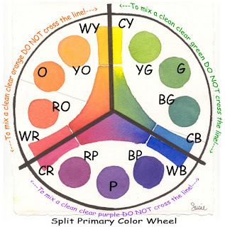
Here's how the Split Primary Palette works:
Let's start with a color wheel arranged like a clock (illustration above) and divided into three equal sections. At the top of the wheel (12 o'clock) a cool yellow, like Hansa Yellow Medium -- a lemony, slight bias to blue-green is on the right of the line; a warm yellow, like New Gamboge -- a golden, slight bias to red-orange is on the left of the line. Going clockwise around the circle (at 4 o'clock) there is a cool blue, like Phthalo Blue (GS) -- an icy, slight bias to blue-green is above the line; a warm blue, like French Ultramarine -- a purplish blue, slight bias to violet is below the line. Continuing clock wise, (at 8 o'clock) a cool red, Quinacridone Rose -- a rosy, slight bias to red-violet is below the line; a warm red, Pyrrol Scarlet -- a tomatoey red, slight bias to red-orange is above the line.
To mix the oranges, mix the red and yellow within the lines to the left of the circle. First mix orange, and then add more yellow for yellow-or ange and more red for red-orange.
To mix the greens, mix the blue and yellow within the lines to the right of the circle. First mix green (2 o'clock), and then add more yellow for yellow-green (1 o'clock) and more blue for blue-green (3 o'clock).
To mix the purples or violets, mix the pink or rose with the blue within the lines at the bottom of the circle. First mix purple (6 o'clock), and then add more blue for blue-violet (5 o'clock) and red for red-violet (7 o'clock).
Now here's the rule that makes this theory work: When mixing two colors on the wheel to achieve high-intensity color, don't cross over the line/stay in each section. Crossing over the lines and mixing the colors on either side of the line causes the mixtures to become less intense and slightly grayer. Cross two lines and even more graying occurs. This graying is called neutralizing. It is the result of a slight touch of that third color being added to the mix.
Hint: To mix earth colors, you simply cross over the lines or add a warm neutral to your mixtures. That's where Quinacridone Burnt Orange -- the seventh color of our essential 7 basics-enters the scene... it's a versatile warm neutral.
You have several good choices for professional artist grade watercolors to choose from.
My palette is currently filled with Daniel Smith Extra Fine Watercolors.
Materials List for Susie's Split Primary Palette
DANIEL SMITH Extra Fine Watercolors
Seven 15ml Tubes - Essential Set offered by Daniel Smith at 40% off regular tube price)
Set contains:
Hansa Yellow Medium
New Gamboge
Phthalo Blue (GS)
French Ultramarine
Quinacridone Rose
Pyrrol Orange
Quinacridone Burnt Orange
Thanks for your questions Judy! Have fun painting and mixing up pretty colors!
SUSIE
For more information about Color check out Nita Leland's book EXPLORING COLOR
and her latest release CONFIDENT COLOR
Color Mixing - Simplified
QUESTION: About color mixing....I'm not looking for the chemical make up of paints but more for the "how to" of mixing paints. Which can be mixed without creating mud. Which colors compliment others visually. How to create a great black or green etc. That type of thing. Thanks.
SUSIE'S REPLY: These are multi-million dollar questions! I'll try to break this down and make it as simple as I can. A quick review of basic color theory reminds us there are three (3) primary colors: RED - YELLOW - BLUE.
We can not make these hues by mixing. We can create variations of each hue by adding one or both of the other colors but we can not mix up a true red, yellow or blue.
Secondary colors or hues (green, orange, and purple) are created by mixing two primaries. Red+yellow=orange; red+blue=purple; blue+yellow=green
Any time the other primary is added chances are the color will be muddy.Example: blue+yellow=green + a tiny bit of red= olive green; not a clean clear true green.
When we use a paint that has the third primary color already premixed into the tube the result is a neutralized or grayed or muddy looking color.
So, in answer to your question about what paint colors can be mixed together without making mud we do need to consider what's already in the tube of paint. Anytime you have a combination of all three primaries you will have a duller more neutralized color. The more equal the amounts of the three colors the muddier or grayer the color will be.
Think about it this way: if a color looks greenish, you know it has blue and yellow in it. If you mix that color with any color that has some red in it the possibility for mixing mud is greater. The more equal the ratio of red + yellow + blue the more neutral the resulting color will be.
Many times we create duller looking colors by over mixing them in our palettes before we apply them to our watercolor paper. If we allow these same colors to "mingle" on our paper and mix together naturally they usually do so in a visually pleasing way.
As for premixed tube color formulas: There are probably as many "formulas" for mixing visually pleasing neutrals as their are watercolorists. For a dark gray or black one very popular combination is Ultramarine Blue and Burnt Sienna. Another formula for black is Alizarin Crimson and Hookers Green.
Here are some tips:
SUSIE'S REPLY: These are multi-million dollar questions! I'll try to break this down and make it as simple as I can. A quick review of basic color theory reminds us there are three (3) primary colors: RED - YELLOW - BLUE.
We can not make these hues by mixing. We can create variations of each hue by adding one or both of the other colors but we can not mix up a true red, yellow or blue.
Secondary colors or hues (green, orange, and purple) are created by mixing two primaries. Red+yellow=orange; red+blue=purple; blue+yellow=green
Any time the other primary is added chances are the color will be muddy.Example: blue+yellow=green + a tiny bit of red= olive green; not a clean clear true green.
When we use a paint that has the third primary color already premixed into the tube the result is a neutralized or grayed or muddy looking color.
So, in answer to your question about what paint colors can be mixed together without making mud we do need to consider what's already in the tube of paint. Anytime you have a combination of all three primaries you will have a duller more neutralized color. The more equal the amounts of the three colors the muddier or grayer the color will be.
Think about it this way: if a color looks greenish, you know it has blue and yellow in it. If you mix that color with any color that has some red in it the possibility for mixing mud is greater. The more equal the ratio of red + yellow + blue the more neutral the resulting color will be.
Many times we create duller looking colors by over mixing them in our palettes before we apply them to our watercolor paper. If we allow these same colors to "mingle" on our paper and mix together naturally they usually do so in a visually pleasing way.
As for premixed tube color formulas: There are probably as many "formulas" for mixing visually pleasing neutrals as their are watercolorists. For a dark gray or black one very popular combination is Ultramarine Blue and Burnt Sienna. Another formula for black is Alizarin Crimson and Hookers Green.
Here are some tips:
- Testing the colors on your own palette to see what color combinations you can make will be helpful. Make a color chart. Avoid mixing more than three colors, better yet try not to mix more than two premixed tube colors.
- Read the labels on your paint tubes. If they contain two or more pigments know that they are good candidates for mud makers when mixed with additional colors using multi-pigments.
- Another thing to consider is that each brand of paint has different ingredients even though it may have the same color name. So one brand of cobalt blue may mix up differently than another brand of cobalt blue.
My personal recommendation for all new painters ( or anyone who is confused about mixing colors) is to use a limited palette of basic compatible core colors. The brand of paint isn't as important as the choice of your basic colors. Stick to using this limited palette for a period of time to allow you to get acquainted with color mixing and learn all you can about what these core colors will and will not do for you. If you are a prolific painter six months may be enough time for you to work with a limited palette. If you don't have time or don't paint very often you may need as much as a year of working with a limited palette to get the hang of color mixing.
For more information look for my article published by Daniel Smith Some Thoughts on Color and using a Split Primary Palette.
Hang in there! The more you practice the better you will get!
SUSIE
P.S. Be sure to sign up for email updates to this blog to be notified when additional information is shared!
Tuesday, August 19, 2008
Phthalo Blue -- warm or cool?
QUESTION: Hi, I Have a question about M. Graham phthalocyanine blue 15.3.
Is it a warm or cool blue? Thank you, Debbie
SUSIE'S REPLY: Hi Debbie,
Most Phthalo Blue is PB15 and lean to the the greenish side of blue. In recent years some manufacturer (including M.Graham) have added an additional Phthalo's to their line that has been altered to have a more "purple" blue look. Look for the Phthalo Blue (RS) which stands for red shade.

Is it a warm or cool blue? Thank you, Debbie
SUSIE'S REPLY: Hi Debbie,
Most Phthalo Blue is PB15 and lean to the the greenish side of blue. In recent years some manufacturer (including M.Graham) have added an additional Phthalo's to their line that has been altered to have a more "purple" blue look. Look for the Phthalo Blue (RS) which stands for red shade.
From the manufacturers information I find that M.Graham's Phthalo Blue PB15:3 is altered to be more of a "true blue" and is a structural variant of Phthalo Blue PB15 (that produces more greenish tones. )

Here is a link to the M.Graham site with more technical information about their watercolors.
OK........that said, let's talk about warm vs cool.
Warmer or cooler is relative. It depends on the two colors you are comparing.
Red is warm and blue is cool... and its easy to see which is which.
All blues are cool when compared to any red. But when we compare several colors of the same hue (in this case blues) Manganese blue might be cooler than Antwerp blue and Ultramarine might be warmer than Cerulean blue. You have to visually compare them to see where they fit on the color wheel.
Because warm vs cool is relative to the two colors you are comparing, I find it's much easier to describe a color by naming the secondary hue it leans toward than to try to distinguish the difference by warmer or cooler. Example: New Gamboge is a orangish yellow and Hansa Yellow is a greenish yellow.
When comparing Phthalo blue(GS) to French Ultramarine Blue, Phthalo is slightly greener than Fr. Ultramarine blue which to my eye looks slightly purplish. So I say Phthalo is cooler, because on the color wheel it is closer to the coolest hue which is blue-blue-green.
The Fr Ultramarine is on the warmer side because it has a touch of red in it thus it farther away from the coolest color and closer to the warmer hues.
Now to answer your specific question: It is my opinion that M Graham's Phthalo 15.3 is very near a true blue. It has been altered so it doesn't lean toward a green hue as with the Phthalo Green Shade (GS) or a purple hue as the Phthalo Red Shade (RS). So I guess I'd say it is neither warm nor cool by itself. If we compared it to another blue I could tell you if it was warmer or cooler than the other blue hue.
I hope that is sufficient. It's not a simple answer.
Thanks for asking!
SUSIE
Wednesday, July 16, 2008
Color Wheel Placements
QUESTION: Susie,
I have both the Susie Short basic 7 set of split primaries and the "intermediate" set from Daniel Smith. My question is how do I know where the intermediate set fits in on the color wheel--in other words, is there a way to tell if Quinacridone Coral is warm or cool? Do you have a handout that shows how those colors fit in?
Thanks --- Judi
SUSIE'S REPLY: Hi Judy, Thanks for your question. There is not a hand out for placement of the intermediate colors on a color wheel. I do have a recommended palette layout for watercolors on my website that includes most of my colors by Daniel Smith. (It's rotated for easy printing.)
One of the best ways to determine if a watercolor paint is warmer or cooler than it's neighbor is to paint a little postage stamp size swatch of each and compare them. If you still can't visually see the difference, try mixing a secondary color with it. For example: If you were testing a red (like Quinacridone Coral!) mix an orange. If you get a pretty clean orange instead of slightly dirty looking orange then the red doesn't contain blue and would be considered a warm red. For secondary colors you simply need to visually compare them to each other, no mixing required.
BTW: Quinacridone Coral is a nice warm red. Compare it to Quin Rose or Quin Pink which both have a touch of blue in them.
HINT: If you make swatches of all the colors you plan to put in your palette you can arrange these little color swatches in the order you want to place them in your palette. Its easy to make adjustments and rearrange them "before " you squeeze out the paints.
I hope that helps! Thanks again for your question!
SUSIE
__________________________________
I have both the Susie Short basic 7 set of split primaries and the "intermediate" set from Daniel Smith. My question is how do I know where the intermediate set fits in on the color wheel--in other words, is there a way to tell if Quinacridone Coral is warm or cool? Do you have a handout that shows how those colors fit in?
Thanks --- Judi
SUSIE'S REPLY: Hi Judy, Thanks for your question. There is not a hand out for placement of the intermediate colors on a color wheel. I do have a recommended palette layout for watercolors on my website that includes most of my colors by Daniel Smith. (It's rotated for easy printing.)
One of the best ways to determine if a watercolor paint is warmer or cooler than it's neighbor is to paint a little postage stamp size swatch of each and compare them. If you still can't visually see the difference, try mixing a secondary color with it. For example: If you were testing a red (like Quinacridone Coral!) mix an orange. If you get a pretty clean orange instead of slightly dirty looking orange then the red doesn't contain blue and would be considered a warm red. For secondary colors you simply need to visually compare them to each other, no mixing required.
BTW: Quinacridone Coral is a nice warm red. Compare it to Quin Rose or Quin Pink which both have a touch of blue in them.
HINT: If you make swatches of all the colors you plan to put in your palette you can arrange these little color swatches in the order you want to place them in your palette. Its easy to make adjustments and rearrange them "before " you squeeze out the paints.
I hope that helps! Thanks again for your question!
SUSIE
__________________________________
Sunday, July 13, 2008
More Watercolor Terms
Color Basics in a Nutshell
QUESTION: Susie, what's the definition of hue vs color? Are they the same? Thanks! Sally K.
QUESTION: Susie, what's the definition of hue vs color? Are they the same? Thanks! Sally K.
SUSIE'S REPLY: Hi Sally! Simply speaking yes, they are the same.
Here is a list of definitions of commonly used terms as they relate to watercolor.
- Hue -- The name of a color, such as red, blue, yellow, green, orange, etc.
- Intensity -- The strength, brightness, or purity of a color; its chroma.
- Saturation -- The measure of brilliance or purity of a color.
- Value -- The lightness or darkness of a color; pure colors will vary greatly in value.
- Temperature -- The warmth or coolness of a color; also relative terms in comparison to other colors in context.
- Primary Colors are those hues that cannot be mixed from any other colors-- red, yellow, and blue. From these primaries, most other colors can be mixed.
- Secondary Colors are the resulting hues of mixing two prima ries in equal amounts.
(R+Y =Orange, Y+B=Green, B+R=Purple) - Intermediate Colors are products of mixing one primary and a secondary.
(R+O=Red-Orange, Y+O=Yellow-Orange, etc.) - Tertiary Colors are products of mixing two secondary colors.
(O+G, O+P, G+P, etc) - Complementary Colors are two hues directly opposite each other on the color wheel.
Complement to a primary color is the combination of other two primaries.
Complement to Red is Green (Y+B),
to Yellow is Purple (R+B),
to Blue is Orange (R+Y). - Neutral Hues are the results of combining all three primaries in various amounts, thus neutralizing the intensity and saturation of a hue. Combining a primary with its complement results in a neutral hue.
_________________________________
warm vs. cool
QUESTION: Hi Suzie, This question concerns "warm vs. cool" colors. If yellow is the "warmest" color on the pallet , and assuming it come in both a warm and a cool version...does the warm version have more red in it? How can that be if moving toward red is moving AWAY from the warmest color (yellow) ? Thanks for your thoughts! Holly
SUSIE'S REPLY: Hi Holly!
I'm happy to share my understanding of "warm vs. cool" with you.
Using a visual color wheel for reference; I believe the warmest color is red-orange and the coolest is blue-green. Let me offer this brief explanation:
SUSIE'S REPLY: Hi Holly!
I'm happy to share my understanding of "warm vs. cool" with you.
Using a visual color wheel for reference; I believe the warmest color is red-orange and the coolest is blue-green. Let me offer this brief explanation:
- Both red and yellow are commonly considered warm, while blue is unquestionably cool. More specifically, warm and cool colors are relative to where a color falls on the color wheel. The warmest color is red-orange and the coolest color is blue-green. Everything between those two points has a slightly warmer color on one side of it and a slightly cooler one on the other. Its neighbor is either warmer or cooler depending on the direction you go around the color wheel.
- For my basic palette I use a split primary palette, working with a warm and a cool of each primary color. (WR/CR - WY/CY - WB/CB) All secondary hues are mixed from my carefully selected (split) primary colors.

When comparing any two colors of the same hue - one will probably be either warmer or cooler than the other. If you are comparing two yellow hues, the color with more red is warmer than the yellow with more blue in it. If you continue to move around the color wheel toward red the yellow turns into yellow-orange then orange then red orange before you get to the warm reds and to true red. [True red contains a tiny bit of both warm red (hint of yellow) and cool red (with a hint of blue.)]
If we continue around the color wheel we move from true red to the cool reds and move into the purples as we add more blue.


Blue hues are the most controversial ones! There are differing opinions about blue-greens being cooler/warmer than blue-violets and vica-versa.
I find for me personally it is easier for me to comprehend and understand if I look at the color wheel and see where a color falls. If it is closer to red-orange than it is to the blue-green then it is a warmer version of the hue.
Keep in mind.... "no matter what hue the color is, the color temperature (or the warmness or the coolness) of a color is relative to what you compare it too.
I'll be posting more thoughts on color theory. Click here to read "Some Thoughts on Color: Working with a Split Primary Color Palette" an article I wrote for "Inksmith" published by Daniel Smith.
Thanks for your question!
SUSIE
_______________________________
Subscribe to:
Posts (Atom)