Question: Susie, Have you ever tried the "Magic Eraser?" It is found in the cleaning section of the grocery store. It removes paint from watercolor paper, totally and without damage to the paper's surface. Just dampen the eraser rub and whala....white paper again!
My friend has removed painted areas from nearly her entire sheet. The paper was put under running water and she used the magic white eraser to take off all the paint, 140lb. is what she paints on.
"Mr. Clean" is on the outside of the package. As the sponge is used, it disintegrates. Sharon
Susie's Reply: Hi Sharon! Yes! I've used the Magic Eraser and find it a great tool for lifting. If you have used non staining colors it will lift almost back to pure white paper. Last month I demonstrated how I use it with my own hand cut stencils to retreive highlights on pumpkins. By cutting out the shape you want you can get sharper edges than with the eraser alone.
To those of you who are new to the Mr Clean Magic Eraser it's a very dense light weight sponge. If you'd like to try it, look for the solid white block NOT the one with the blue scrubber added on one side. I've also found generic knock off sponges or store brands with 3 sponges per package. They work the same and are a little more economical.
Thanks for reminding me to share this tip Sharon!
SUSIE
Monday, November 23, 2009
Monday, July 20, 2009
Copyright and online lessons?
QUESTION: If I paint a watercolor from an online lesson, after I paint it, can I consider it my work? Are online lessons copyrighted also? Wilma
SUSIE'S REPLY: Hi Wilma, This is a great question! There are so many online lessons available to the public over the Internet its easy to get confused as to when the legal lines are crossed or not.
*****(First of all I'm not an attorney so this information is based on my understanding of copyright law. Please check with a certified attorney for any and all legal interpretations.) *****
The way I understand the copyright law is all art is considered copyright protected by the original artist upon creation. If you copy it as a lesson to learn from the copyright still belongs to the original artist (not you). Artists know when they offer published lessons in books or online the work will be copied and therefore they give an implied consent for you to copy it for learning or educational purposes. You can not claim it as your own work, nor should you sell it as your own work.
Think about it this way... if you copy it...it IS A COPY. If you create it from your own imagination without looking at someone work then you are creating your own original work of art. Be inspired and motivated by others but don't copy.
Thanks for asking! Happy Painting!
SUSIE
Niji Waterbarrel Brushes - with a water reservoir in the handle
QUESTION: Hi Susie, I enjoyed seeing your sketch of Sumner, WA. using the NiJi watercolor pens. It was so bright and cheerful. I was wondering if you could expand a bit to include how you accomplished this on your web site. I'd like to know which sizes you used, how they blended, how much color to carry in the tubes and most of all how many of each size brush to buy so that you have enough for what you want to do. I am not good with just hearing a mm description. I am a hands on person and I don't think I'm alone in this. I wish Daniel Smith would include this also in their Inksmith articles or on their web page.
And I just want to let you know how wonderful your Beyond the Sunset DVD is! Thank you so very much, Judith R --Tacoma, WA.
Note: The Sumner sketch she's referring to can be found on my Splashes & Splatters Blog
SUSIE'S REPLY: Thanks Judith!
The Yasutomo Niji Waterbrush is a nifty brush with a water reservoir in the handle. I use the round style and it comes in 3 sizes; small, medium and large. There is also a mini version that has a shorter handle but the brush head is a medium in size. All of these brush heads are interchangeable and will each fit any of the handles so if you run out of water in one you can easily change to another handle with more water.
You could get by with just one medium size brush. It has a fairly nice point for making fine lines.
But the water barrel brushes are so affordable I'd at least start with one of each size. (S-M-L)
I did find that I used my larger brush more aggressively (to cover larger areas) and after a couple of years of scrubbing the paper with it the point did get frazzled. But it still works for scrubbing in trees and bushes so I save my newer one for adding details and painting where I need to control the edge.
There is a flat version available also. However, I didn't find it as useful to my personal painting style as the round brushes, so I hardly ever use it for painting but it does serve as a backup water supply! Try it! You may like what it will do and enjoy using it.
Directions for use: To fill the brushes either hold them under a running faucet or submerge them in a bowl of water and gently squeeze and release several times to push out the air and suck in the water. I fill them with as much water as they will hold. I've never had one leak, but as a precaution if I'm carrying my brushes in the same container with my paper I do put them is a small plastic baggie for transport.
To use these brushes in the field, I start by squeezing the handle to allow a small amount of water to wet the brushes nylon bristles. Then I moisten the dried paint in my folding watercolor travel palette to pick up pigment in the brush to apply to my paper. If I want a lighter value I simply swirl the brush on my palette until the water feeds down to dilute the paint to the desired value. My experience has been that I get better results if I let gravity help feed the water to the brush head rather than squeezing the handle as I stroke it on the palette for mixing or my paper as I paint.
The water barrel brush is almost self cleaning. Just a quick back and forth stroking on a paper towel will cause the water to pass through the brush head and rinse away any remaining pigment.
Keep in mind when I'm painting "en plein air" I like to work a little on the dry side to have more control. In other words I use more dry brush techniques than fully wet juicy brush techniques.
Thanks for your inquiry! I hope I've answered your questions satisfactorily and have inspired you to try these brushes for yourself. Watch my website and when I'm painting in your area I hope you will join me!!
Happy Painting!
SUSIE
PS. I forgot to tell you where to find the Niji Water Brushes...They are available in many arts and crafts stores. I've seen them in Michaels, JoAnn's and Hobby Lobby. Online check Daniel Smith -- Dick Blick -- Cheap Joe's -- Artsuppliesonline.com -- to name only a few. I know I'm leaving some quality online sources out so check your favorites to see if they carry these nifty brushes for summer painting fun.
Monday, March 9, 2009
Watercolor Brushes - Do's & Don'ts
QUESTION: Do you have any tips on how to take care of my new watercolor brushes. Thanks!
SUSIE'S REPLY: Yes, I do! Here is a quick list of do's and don'ts.
SUSIE'S REPLY: Yes, I do! Here is a quick list of do's and don'ts.
Do wash your hands before handling your brushes to remove any body oil or lotion.
Do wet your brush before picking up pigments.
Do rinse and reshape the brushes you are working with even during a painting session.
Do clean your brushes using soap and water to remove paint residue.
Do use tepid or lukewarm water for cleaning. Never use HOT water.
Do air-dry your brushes laying them on a flat dry surface. (or hanging from the handle hairs pointing downward.)
Do keep brushes in a brush holder (during transport) to protect then tips from becoming crimped.
Do store dry brushes in air tight container when not in use for extended periods of time to protect then from moths and dust.
**************************************************************************
Don’t pick up paint with a dry brush. (Wet the brush first by gently stroking it against the bottom of the water container to work out trapped air bubbles.)
Don’t use a watercolor brush for painting with oils or acrylics, inks or dyes.
Don’t use a good watercolor brush to apply maskoid, masking fluids or resists.
Don’t let your watercolor brush dry out with paint in the hairs.
Don’t pull a stuck dried brush from your palette (To remove: moisten it first to soften the dried paint to release the brush from the palette with out fraying the brush ends.)
Don’t leave a brush standing on its head in a jar (wet or dry)
Don’t submerge a brush beyond the ferrule for extended periods. (metal ring)
Don’t try to reshape it using a scissors or a razor blade.
Don’t pinch or pull at the hairs to remove excess moisture…be gentle.
Don’t dry a watercolor brush with a hair dryer. (Air dry lying them flat)
Don’t dry your brushes with the tips pointed up in a jar. (Ok for storing after drying.)
Don’t use a good watercolor brush to scrub with.
Don’t store a damp brush in an airtight container. This encourages mold and mildew.
Thursday, February 26, 2009
Watercolor Manufacture's Charts for Color Temp etc
QUESTION: Is there a list of colors(especially Daniel Smith) that show if the color are Warm or Cool, Transparent or opaque, staining or non staining. This would be so helpful. Thank You. Pam
SUSIE'S REPLY: Hi Pam!
Daniel Smith does have a printed color chart that gives you most of this information including lightfastness. While the chart doesn't list the tube colors as warm or cool it does arrange the little color swatches by their chroma starting with the cooler yellow hues moving to the warmer yellows, then the oranges and warm reds, then to the cool reds and purples, warmer blues hues then to the cooler blues before they show their earth colors.
I spoke with the nice folks at Daniel Smith today and they tell me if you call their customer service they will mail you a copy. You will need to call during business hours so you can talk to a real person. 1-800-426-7923 ( Tell them I said hello!)
The same chart can be found in their 2008-2009 reference catalog on pages 10-11. I'll try to add a link below to take you to it online. If it doesn't work go to http://www.danielsmith.com and look for the tab for their online catalog. Here is the link: Daniel Smith Paint Chart I hope that link works.
Also....If you go to the Daniel Smith website and click on the watercolor paints you will get a colored list of paints again starting with yellow. You can click on each color and get more information about that individual color that's not included on the printed color swatch chart.
Most manufacturers (Winsor Newton, Holbein, Rembrandt, etc) have printed materials with paint information available for artists. Try doing a search for these by manufacturer's name.
Another great watercolor resource is http://www.handprint.com/HP/WCL/water.html
It's got so much information it can be overwhelming.
For paints: http://www.handprint.com/HP/WCL/waterfs.html
At the top of the page is a navigation bar arranged by color names.... have fun exploring!
SUSIE
Split Primary Palette - Warm Reds
QUESTION: I've already asked this in the WCW, but got no response. Need help! I just got my Susie Short Essential 7 set from Daniel Smith. I noticed that there is no Pyrrol Scarlet that you refer to in your article, here. Instead, I got Pyrrol Orange, which is what is in the set as ordered, and also mentioned further down in your article on the website.I'm going to be squeezing these into pans. Is the Orange a substitute for the Scarlet?I just want to make sure I have the right colors first in case I have to return one.That asked - if the Pyrrol Orange is right, what would be a good Daniel Smith color to use as a secondary between it and the warm yellow (besides mixing) as I might be adding the secondaries as straight colors to my 12-pan box later ( I can't stand the site of empty pans staring back at me). Matt
SUSIE'S REPLY: Hi Matt!
When Daniel Smith put my "Essential 7" Split Primary Palette into a set, I selected the Pyrrol Orange as part of the set. With all the tubes of red to choose from almost all of them are either more of a true red (containing a touch of blue) or bias to purple and did not mix a visually clean clear orange.
Allow me to explain that there is nothing wrong with the Pyrrol Orange in the set, it works as a warm red but it does have more yellow in it making it slightly more orange than it needs to be. Since then I've discovered that the Pyrrol Scarlet and Quinacridone Coral both work for as good substitutes for a warm red in my Split Primary Palette.
I'm in the process of testing some additional colors for a full spectrum 12 (tube) color palette. The testing is to find as close to exact complement tube color as I can for each of the 12 paints. I'm trying to restrict my choices to paint made with single pigments if I can. It's a delicate mixing dance, but it's fun and I'm close to finding the right colors.
Thanks for your question! Good luck with your colorful adventure!
SUSIE
PS. I highly recommend Nita Leland's latest book CONFIDENT COLOR for anyone wanting to learn more about working with a variety of color palettes. You'll find a link to see this book on Amazon in the sidebar. It's worth every penny!
Watercolor Brush Care/Repair
QUESTION: My watercolor brush is loose. The metal ring holding the brush "hairs" wiggles and is no longer tight on the handle. It was expensive. What can I do?
SUSIE'S REPLY: Ouch! Loosing a favorite watercolor brush, expensive or not, is almost like loosing a good friend isn't it?
The most common cause for a loose ferrule (the metal ring that connects the brush hairs to the handle) is leaving the brush submerged in water too long. If the handle is made of wood, the wood swells in the water and when it expands it loosens the ferrule and cracks the protective paint on the handle. Using a pair of pliers you can gently crimp the ferrule close to the handle to stop most of the wiggle.
If that doesn't work, use an awe or nail to puncture the ferrule making a hole in the metal to grip into the wooden handle. I sometime use fingernail polish to fill in the cracks in the paint to keep the handle for absorbing some of the water.
I've also seen some old loose brushes with a wire tightly securing the ferrule to the handle. Not to be confused with the mop brushes that are made this way to begin with. Hey, if it works why not?
If the handle is plastic, you can try to get some "super glue" under the ferrule to reseal and reattach it to the handle. Use a glue that's not water soluble.
As a preventative measure, above all don't leave a brush standing in a water container for an extended period of time.
I hope you can save your brush!
SUSIE
Erasing pencil lines in watercolor paintings
QUESTION: Hi there, this may seem silly...I am teaching myself to paint with oils and watercolor. I love it so much and am teaching my grandson(8) as well. We are learning together . How and when do you get rid of the sketch marks, I use a light pencil touch and then watercolor over it. How do I get the pencil marks to not be there after painting? Thanks, Carol
SUSIE'S REPLY: Hi Carol! How wonderful to have your grandson as a painting partner!
Removing the pencil lines in painting is a common question and not silly at all. For some artists the pencil marks are carefully placed to become an intricate part of the painting. They fit and look great for that particular style of painting!
However for many of us the pencil lines are not intended to be seen after we apply the paint to our paper and we want the lines to "go away!"
Using a light touch will make erasing easier. Unfortunately, some colors seal the graphite or pencil lines so that when we paint over them they cannot be erased. Other colors allow for easy removal. Experimenting will help you learn more about the colors in your palette.
OK, that said here are some tips, not all will work every time but they are worth a try.
- Do your preliminary sketching on drawing or tracing paper. Make corrections and simplify the drawing before you transfer it to your watercolor paper. The more you erase on the watercolor paper the more your damage the surface.
- Transfer the simplified basic shapes first. Apply the first layers of the painting then add more details as needed.
- Use a light touch or a fine pencil line. A soft pencil will leave more graphite to smudge or smear or mix into your paint than a hard pencil.
- Use the pencil lines as a guide and not an edge. In other words paint up to a line but don't paint over it and it will be easier to erase.
- Erase as you go. When a passage is dry clean up the excess pencil lines that are no longer needed.
- Use an eraser that is gentle to your watercolor paper. I recommend the Magic Rub by Sanford/PaperMate. It's a white a vinyl eraser designed to erase cleanly. You can find it in most art stores, office supply stores, at drugstores in the school supplies, or online. I did a search for Magic Rub eraser and got several hits.

Please note: Erasing the lines from using graphite paper to transfer your drawing to your watercolor paper is different than using a pencil. Some brands of transfer papers are slightly waxy which makes them more difficult to remove.
Good luck with your watercolor journey! Be sure to check out my free tips on my website. You may find some lessons you can share with your young artist. www.susieshort.net/watercolor-tips.html
Happy Painting!
SUSIE
-----------------------------------------------------
Signatures on Watercolors
QUESTION: Susie, how do you suggest we sign our watercolor paintings? I was reading another blog talking about signing their art work they said "if you painted a purely watercolor painting and signed the painting with an ink pen, it was now a mix media painting. What do you think?" CV
SUSIE'S REPLY: My, this is a loaded question!
Obviously, if your painting is to be entered into a competition go by the rules outlined in the prospectus. Many shows have strict regulations against using anything but transparent watercolors in the paintings. Rules are rules and its usually not the juror but the board or show directors who do the regulating.
Outside of the competitions.... I think there could be several legitimate choices.
Let's look at a few choices:
- Watercolor is preferably the first choice. It can be painted on using a brush, or by using a stylus in a damp area a signature can be "imprinted or scratched" into the paper. This method allows the signature to blend into the painting. It's easily seen but not distracting.
- Watercolor pencils are dried watercolor in pencil form and are easy to use. If the marks made with the watercolor pencil appears to be sitting on top of the paper,,, try running a damp (not wet) brush over the signature. This will help it integrate with your painting.
- Ink - is used by many artists. It's convenient and easy to use. Preferably, it should be an archival water based ink. (Avoid petroleum based inks.) Some of the archival gel pens manufactured for scrap booking are recommended even in darker areas.
- Pencil is also a reasonable choice, especially if any line drawing is used as an important part of your watercolor painting.
So what do I think about a painting being classified as Mixed Media when you use ink for a signature? For what it's worth, I do not believe using ink just for the signature should turn a watercolor into mixed media.
However, if there is a question, or becomes an issue why push your luck?
More than anything paint it and sign it! Then move on to the next one!
SUSIE
Monday, February 23, 2009
Phthalo Blue GS and RS
QUESTION: What's the difference between Phthalo Blue (GS) and Phthalo (RS)? Thanks!
SUSIE'S REPLY:
Phthalo Blue (GS) green shade PB 15 A cool blue slightly bias toward green
ASTM Lightfastness Rating: Excellent
Transparency: Transparent
Granulating: No
Staining: Staining
Phthalo Blue (RS) red shade is also made with PB 15 but has been altered to lean more toward purple than green. Compare this color to French Ultramarine Blue. You get the same look without the sedimetary properties.
ASTM Lightfastness Rating: Excellent
Transparency: Transparent
Granulating: No
Staining: Staining
SUSIE
Gum Arabic in Watercolor Paint
Great website - thank you for all the great tips. Please tell us the proper use of gum arabic. When do you use it and how much do you use. Thank you. Greg
SUSIE'S REPLY: Hi Greg!
Gum arabic is a water soluble binder made from the sap of the acacia trees. It's most commonly used in the manufacturing of artist's quality watercolor and gouache paints as well as pastels.
As a binder it helps the watercolor pigments stick to the watercolor paper. However it can be dissolved again in water, even after it has completely dried. This is why watercolors can be rewet after they have dried on the palette, or can be lifted from the paper when they are rewet.
Some artists add extra gum arabic to their watercolor paint to increase the body and flow of the paint. It is also used to add a glossy look to the paint, but you must be careful not to add too much as the paint may become brittle and may flake off.
In my watercolor experience I've found if I stick with professional quality brands of watercolor paints I don't need to make any adjustments to their formulas. The saying "if it ain't broke don't fix it!" applies.
I have added a few drops of gum arabic along with several drops of distilled water to rejuvenate the contents of a tube of rock hard dried watercolor paint. How much gum arabic do you use? I've read 3:1 or 4:1 ratio is a good formula. (Three or four drops of water to one drop of gum arabic.)
I hope that answers your question! Thanks for asking!
SUSIE
Beading problems with New Watercolor Palettes
QUESTION: Hi Susie, There must be a 'trick' to preparing the wells in my watercolor palette. I'm new to watercoloring and I've bought three different palettes and each one causes the paint to 'bead' up into a tiny little puddle that almost disappears before I start. What do I need to do to keep this from happening? Some tell me to clean the wells with Comet. It didn't help at all. MJ
SUSIE'S REPLY: Welcome to watercolor MJ! You have so much fun ahead of you!
Beading is definitely a common problem with new plastic palettes especially in the center of the palette where the all mixing takes place. They are so slick and smooth that the wet watercolor just beads up instead of making a nice puddle for you to work with.
What do you need to do to keep this from happening? The solution is simple.....just paint! It is an annoyance at first, especially when you are new to watercolor anyway, but I promise the more you mix and blend and use your palette the faster the mixing area will get "seasoned" and the beading will stop.
As for the wells, I always fill the wells with an generous amount of paint. I like to work with dry paint so I actually fill the wells and allow the paint to dry before I paint with it. Even if you prefer to use fresh paint, a generous squeeze of paint is better than a tiny dab. The lid will help the paint stay moist for quite a while, and if it does dry out you can rejuvenate it with a fresh dab of paint or a damp brush.
I don't recommend using a scouring powder on the plastic surface of your watercolor palette. They just scratch it and cause the surface to stain easier.
Another tip for watercolor palettes is to always use a damp paper towel or rag to wipe up your paint puddles. If you wipe them with a dry towel or rag you run the risk of pushing the paint into the plastic surface and staining your palette. All plastic palettes will be a little stained as you use them, but not enough to cause any problems.
I hope that helps! Have fun!
SUSIE
Thursday, January 22, 2009
From Painter to Artist
QUESTION: Hi Susie! I admire your paintings. When I grow up I want to be just like you! (ha)I've been at this for a few years now and I don't feel like I know where to go next. I do pretty good at painting along with my instructors but when I step out on my own I'm lost. How do I go from painter to artist? I'd appreciate your suggestions. Thankfully, Sally
SUSIE'S REPLY: Hello Sally!
Hmmmm, we might need to look at the Moma Bird who has been preparing her fledglings for the day they would leave the nest for this answer. I think there is definitely a spot in the road along our artistic journey where we start to rely more and more on our own instincts and what we have learned and less and less on others.
For some of us it does take courage to venture out on our own. But we all need to try! Just like the baby birds we need to try our wings while the nest is still close enough to get back to if we take a fall. Then try again!
Starting out with an easy project is a good confidence builder. Perhaps you could even redo a successful project you worked on during a class session and make it your own using the same steps you learned in class. Don't shoot yourself in the foot by trying to tackle a difficult project too soon. Keep it simple at first while you test those wings!
Repetition is a good teacher! Select a subject you enjoy painting and see how many different ways you can paint it. Rely on the background you have established with your teacher.
I'll bet you know more than you are giving yourself credit for.
So..... how do you know when you are artist and not just a painter? I guess that depends on your definition of an artist and painter. What's the difference?
I read somewhere that an Artist is creative while a Painter is a follower.
An Artist explores from their heart and soul while painters do it with their hands/mind.
An Artist gets rewarded for his creativity, while painter for his labor.
For me personally I believe I am both an artist and a painter. I think I probably allowed myself to identify or call myself "painter" while I was still learning "how-to-paint". But I believe we can also be artists long before we allow ourselves the title. It comes from within.
If you are getting too big for the nest and your "moma bird" hasn't given you a gentle nudge, you need to flap those wings and give it a try! Trust your instincts!
Happy Painting!
SUSIE
Saturday, January 17, 2009
Color Basics in a Nutshell
Color Basics in a Nutshell
Definitions of terms as they relate to watercolor
Hue -- The name of a color, such as red, blue, yellow, green, orange, etc.
Intensity -- The strength, brightness, or purity of a color; its chroma.
Saturation -- The measure of brilliance or purity of a color.
Value -- The lightness or darkness of a color; pure colors will vary greatly in value.
Primary Colors are those hues that cannot be mixed from any other colors-- red, yellow, and blue. From these primaries, most other colors can be mixed. Secondary Colors are the resulting hues of mixing two prima ries in equal amounts. (R+Y =Orange, Y+B=Green, B+R=Purple)
Intermediate Colors are products of mixing one primary and a secondary. (R+O=Red-Orange, Y+O=Yellow-Orange, etc.)
Tertiary Colors are products of mixing two secondary colors. (O+G, O+P, G+P, etc)
Complementary Colors are two hues directly opposite each other on the color wheel. Complement to a primary color is the combination of other two primaries. Complement to Red is Green (Y+B), to Yellow is Purple (R+B), to Blue is Orange (R+Y). Neutral Hues are the results of combining all three primaries in various amounts, thus neutralizing the intensity and saturation of a hue. Combining a primary with its complement results in a neutral hue.
Temperature "The warmth or coolness of a color; also relative terms in comparison to other colors in context.
"Both red and yellow are commonly considered warm, while blue is unquestionably cool. More specifically, warm and cool colors are relative to where a color falls on the color wheel. The warmest color is red-orange and the coolest color is blue-green. Everything between those two points has a slightly warmer color on one side of it and a slightly cooler one on the other. Its neighbor is either warmer or cooler depending on the direction you go around the color wheel.
Using a split primary palette, we are working with a warm and a cool of each primary color.
All secondary hues are mixed from these carefully selected primary colors.
Thursday, January 15, 2009
Make Your Own Color Chart for Watercolor Paints

The illustration above shows a basic color chart for my core palette colors or what I call the Essential 7. This is a great way to find out what combinations you can mix from these seven paint colors.
To create your own color mixing chart:
- Use a pencil to draw eight rows and columns as shown above.
- To show how transparent or opaque each pigment is, make a black line using a permanent marker before you apply the colors. When you paint over the black line if the color disappears it is transparent, if you can see the pigment sitting on top of the black line then it has opaque qualities.
- Each ROW is about the color/hue in that row and what the other colors in the palette do when mixed with the dominant row color.
- Each COLUMN contains the same colors placed in the same order as in the rows.
- Mix less of the column color and more of the row color for the best results.
- Leave a little white space on either side of the pencil lines (between the color squares) to visually separate the colors.
- NOTE: Each color will be mixed with itself during this process.
- This chart shows the secondary and tertiary color combinations that are possible by mixing only two tube colors.
- It's possible to create many more neutral hues by combining three or more tube colors in the basic split primary palette.
- When the chart was totally dry I erased the pencil lines.
Of course you can make as many rows and columns as you want but I've found that when I want to add new colors to my core palette all I really need to do is add a new row and show how they interact with my 7 core palette colors. If they work with these 7 then I have a color that I can use successfully. If the color isn't compatible with my core palette then I need to be more careful and selective as to how I choose to use that particular paint.
Split Primary Palette
QUESTION: Susie, I was looking for watercolor palette suggestions and found your website. You mention a split primary palette. Would you please explain what a split primary palette is, what colors I need and how to use it? Much thanks for all your help! Judy S. Texas
SUSIE'S REPLY: Hi Judy! Here's what I refer to as a Split Primary Palette
Use a warm and a cool of each primary hue (a warm red and a cool red; a warm yellow and a cool yellow; a warm blue and a cool blue) to mix bright, high-intensity primary called a Mixed Primary Hue. The secret is in using the right split primary colors and not crossing over the lines into another section!
Use a warm and a cool of each primary hue (a warm red and a cool red; a warm yellow and a cool yellow; a warm blue and a cool blue) to mix bright, high-intensity primary called a Mixed Primary Hue. The secret is in using the right split primary colors and not crossing over the lines into another section!
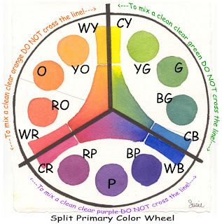
Here's how the Split Primary Palette works:
Let's start with a color wheel arranged like a clock (illustration above) and divided into three equal sections. At the top of the wheel (12 o'clock) a cool yellow, like Hansa Yellow Medium -- a lemony, slight bias to blue-green is on the right of the line; a warm yellow, like New Gamboge -- a golden, slight bias to red-orange is on the left of the line. Going clockwise around the circle (at 4 o'clock) there is a cool blue, like Phthalo Blue (GS) -- an icy, slight bias to blue-green is above the line; a warm blue, like French Ultramarine -- a purplish blue, slight bias to violet is below the line. Continuing clock wise, (at 8 o'clock) a cool red, Quinacridone Rose -- a rosy, slight bias to red-violet is below the line; a warm red, Pyrrol Scarlet -- a tomatoey red, slight bias to red-orange is above the line.
To mix the oranges, mix the red and yellow within the lines to the left of the circle. First mix orange, and then add more yellow for yellow-or ange and more red for red-orange.
To mix the greens, mix the blue and yellow within the lines to the right of the circle. First mix green (2 o'clock), and then add more yellow for yellow-green (1 o'clock) and more blue for blue-green (3 o'clock).
To mix the purples or violets, mix the pink or rose with the blue within the lines at the bottom of the circle. First mix purple (6 o'clock), and then add more blue for blue-violet (5 o'clock) and red for red-violet (7 o'clock).
Now here's the rule that makes this theory work: When mixing two colors on the wheel to achieve high-intensity color, don't cross over the line/stay in each section. Crossing over the lines and mixing the colors on either side of the line causes the mixtures to become less intense and slightly grayer. Cross two lines and even more graying occurs. This graying is called neutralizing. It is the result of a slight touch of that third color being added to the mix.
Hint: To mix earth colors, you simply cross over the lines or add a warm neutral to your mixtures. That's where Quinacridone Burnt Orange -- the seventh color of our essential 7 basics-enters the scene... it's a versatile warm neutral.
You have several good choices for professional artist grade watercolors to choose from.
My palette is currently filled with Daniel Smith Extra Fine Watercolors.
Materials List for Susie's Split Primary Palette
DANIEL SMITH Extra Fine Watercolors
Seven 15ml Tubes - Essential Set offered by Daniel Smith at 40% off regular tube price)
Set contains:
Hansa Yellow Medium
New Gamboge
Phthalo Blue (GS)
French Ultramarine
Quinacridone Rose
Pyrrol Orange
Quinacridone Burnt Orange
Thanks for your questions Judy! Have fun painting and mixing up pretty colors!
SUSIE
For more information about Color check out Nita Leland's book EXPLORING COLOR
and her latest release CONFIDENT COLORColor Mixing - Simplified
QUESTION: About color mixing....I'm not looking for the chemical make up of paints but more for the "how to" of mixing paints. Which can be mixed without creating mud. Which colors compliment others visually. How to create a great black or green etc. That type of thing. Thanks.
SUSIE'S REPLY: These are multi-million dollar questions! I'll try to break this down and make it as simple as I can. A quick review of basic color theory reminds us there are three (3) primary colors: RED - YELLOW - BLUE.
We can not make these hues by mixing. We can create variations of each hue by adding one or both of the other colors but we can not mix up a true red, yellow or blue.
Secondary colors or hues (green, orange, and purple) are created by mixing two primaries. Red+yellow=orange; red+blue=purple; blue+yellow=green
Any time the other primary is added chances are the color will be muddy.Example: blue+yellow=green + a tiny bit of red= olive green; not a clean clear true green.
When we use a paint that has the third primary color already premixed into the tube the result is a neutralized or grayed or muddy looking color.
So, in answer to your question about what paint colors can be mixed together without making mud we do need to consider what's already in the tube of paint. Anytime you have a combination of all three primaries you will have a duller more neutralized color. The more equal the amounts of the three colors the muddier or grayer the color will be.
Think about it this way: if a color looks greenish, you know it has blue and yellow in it. If you mix that color with any color that has some red in it the possibility for mixing mud is greater. The more equal the ratio of red + yellow + blue the more neutral the resulting color will be.
Many times we create duller looking colors by over mixing them in our palettes before we apply them to our watercolor paper. If we allow these same colors to "mingle" on our paper and mix together naturally they usually do so in a visually pleasing way.
As for premixed tube color formulas: There are probably as many "formulas" for mixing visually pleasing neutrals as their are watercolorists. For a dark gray or black one very popular combination is Ultramarine Blue and Burnt Sienna. Another formula for black is Alizarin Crimson and Hookers Green.
Here are some tips:
- Testing the colors on your own palette to see what color combinations you can make will be helpful. Make a color chart. Avoid mixing more than three colors, better yet try not to mix more than two premixed tube colors.
- Read the labels on your paint tubes. If they contain two or more pigments know that they are good candidates for mud makers when mixed with additional colors using multi-pigments.
- Another thing to consider is that each brand of paint has different ingredients even though it may have the same color name. So one brand of cobalt blue may mix up differently than another brand of cobalt blue.
My personal recommendation for all new painters ( or anyone who is confused about mixing colors) is to use a limited palette of basic compatible core colors. The brand of paint isn't as important as the choice of your basic colors. Stick to using this limited palette for a period of time to allow you to get acquainted with color mixing and learn all you can about what these core colors will and will not do for you. If you are a prolific painter six months may be enough time for you to work with a limited palette. If you don't have time or don't paint very often you may need as much as a year of working with a limited palette to get the hang of color mixing.
For more information look for my article published by Daniel Smith Some Thoughts on Color and using a Split Primary Palette.
Hang in there! The more you practice the better you will get!
SUSIE
P.S. Be sure to sign up for email updates to this blog to be notified when additional information is shared!
Subscribe to:
Posts (Atom)